How your brand looks, matters.
Developing a cohesive visual brand identity should directly speak to your audience and how you want to be perceived by that audience. Visual cues within your typography, color palette and logo variations tell a visitor exactly how to feel about your brand. So stop and ask yourself, “does my brand communicate to my target audience how they should feel about who we are as a company and what we do to help them as a customer or client?”
Developing a cohesive visual brand identity that works across platforms from traditional (yet necessary) business cards to social media marketing, your brand must be consistent in not just look but feel.
Whether or not you realize it, your audience is always defining your brand, and if the visual you’re displaying across your digital and print collateral doesn’t match what your company stands for, it will mostly confuse your audience or turn them off completely.
Typography
Let’s take typography for example; we’re not sure how to feel about a real estate agent who uses this font in their marketing materials or website:

This font style makes this real estate agent’s brand feel silly, unprofessional, and not trustworthy. The worst combination for this profession, right? However, there’s a caveat here, we’re all for thinking outside the box when building visual brand identities, but we don’t want it to distract from your business and the value you bring to the table for those you serve.
Also for the record, Comic Sans is another no-no for our creative design department — but that’s a whole ‘nother blog post.
Color
Next, consider color.
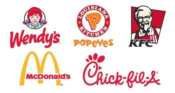
There are boat loads of psychology that go along with how brands use color to evoke that feeling. Think about it, how many fast food brands use red in their visual brand identity? McDonald’s, KFC, Popeyes, Wendy’s, Chick-fila the list goes one. However, Subway opts for green which makes sense with their tagline, “Eat fresh.” Green is often used with brands that cater to the health or the natural product devoted audience. Then there’s Taco Bell who throws us all for a loop with their purple and pink visual identity. When considering or choosing a color palette, consider complementary colors and stick with 2-3 colors max, so you don’t get too Rainbow Bright on your brand. For StellaPop, we first like to discover the brand’s story before selecting strategic color options.
 ]
]
Not sure where to start? Take a peek as tools like paletton.com for inspiration — note: this website it addictive, don’t say we didn’t warn you!
Logo
To round out the visual brand identity, let’s look at the logo.
The logo is often thought of as the symbol in which people identify your brand at-a-glance. This is true, think about Apple. Very rarely do you see their marketing or branding materials contain “Apple” spelled out. Instead, their symbol stands alone as the brand marker.
Then there are the type-only logos like Coca-Cola that is well-known for its classic script on the side of their soda cans. Finally, there are double meaning logos that utilize both a symbol and type. We see you, Fedex and Amazon.
The key when we’re developing a brand identity for a new client or going back in for a refresh is thinking about how the logotype and logo symbol work together and apart to deliver the best product that evokes the same feeling/emotion to the target audience regardless how if one or both elements appear.

Now that you know what needs to be done to get the ball rolling on refreshing or creating your brand, and developing your visual identity, learn more on how your brand shows up and shows off its new look!
Download the cross check(list) to understand where your brand is so you can start to shift gears to drive success.