Sign up! Reserve your spot! Download now! We all encounter a ton of call-to-action (CTA) buttons every day. But which ones do we actually click? And what motivates us to click some but not others?
There should be a strategy behind every button created — from emails to websites to banner ads. Let’s explore some things to consider when writing button copy to ensure a high conversion rate.
1. Focus on the action
This may go without saying, but your CTA buttons need to be action-oriented. “Submit” isn’t good enough. You want to use powerful verbs, such as create, contact, learn, join, shop, explore, start, and discover.
Proposify uses action verbs well here on their homepage, but being that they’re a newer service, they’re testing and are no doubt testing and heat mapping where their audience takes action first on their home page with all of these CTA buttons close together.

2. Create a sense of urgency
Nothing motivates people to take action quite like FOMO (fear of missing out). ![]() Take advantage of this by using words that convey the need to act: now, today, last chance, only X days left, hurry, immediately.
Take advantage of this by using words that convey the need to act: now, today, last chance, only X days left, hurry, immediately.
This is a landing page for a webinar and just above the call-to-action button you can see that there’s a sense of urgency to click because the next web class begins in three minutes. Often times you will also see countdown timers on these types of pages. Another example of urgency is on check-out pages when you’re purchasing tickets for a concert.

3. Meet users where they are
You don’t want to create buttons that might scare off your customers. For example, if I’m just looking for more information about a membership, a button that says “join now” could freak me out. I’m not ready for that step, so I might even abandon the page completely. Keep the specific segments of your audience in mind when crafting button copy. In fact, according to HubSpot:
“Calls-to-action targeted to the user had a 42% higher view-to-submission rate than calls-to-action that were the same for all visitors.”
In other words, know your audience and customize your buttons to ensure they’re seeing calls to action that they actually want to take.

4. Talk directly to the user
The use of me/my/you/your can greatly increase clicks. In fact, one of our top takeaways from #SMMW18 was that a simple point-of-view copy tweak can improve your click-through rate by 90%. For example, “start my 30-day trial” outperformed “start your 30-day trial.” You want to think customer-centric, not company-centric. ![]()
ClickFunnels is playing both sides of point of view coin in these buttons below. On the left you’ll see the subtext is using first person, “Show Me ClickFunnels In Action”, whereas the button the right in the main text is using second person, “Start Your Free 14 Day Trial”. I wonder what would happen if they swapped the “Your” for “My” on the button on the right?

5. Make your buttons pop
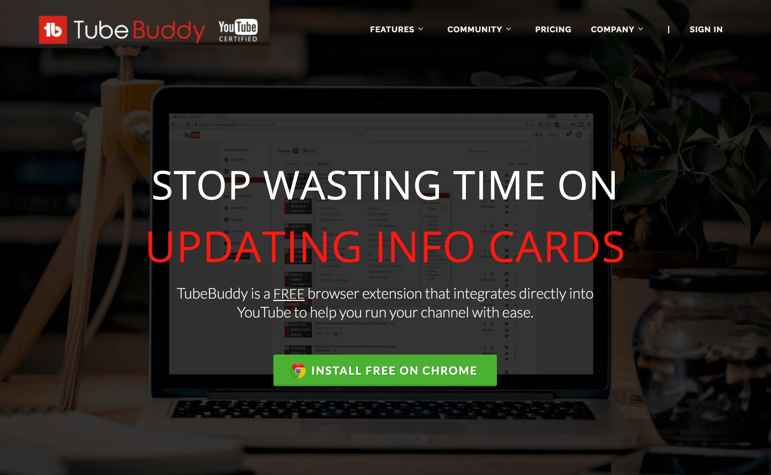
Make sure your button doesn’t get lost. Leverage design elements like the color palette, size, and location to ensure your buttons stand out and are immediately obvious even if someone is just scanning the page.
Can’t get more noticeable than the green button screaming GO! CLICK ME! than the CTA button on TubeBuddy’s homepage.

6. Promote exclusivity
People want to feel special — like they’re getting something that few others are. Buttons that create a feeling of exclusivity can boost clicks. Consider phrases such as, “view members-only content,” “reserve a limited spot,” or “request an invitation.”
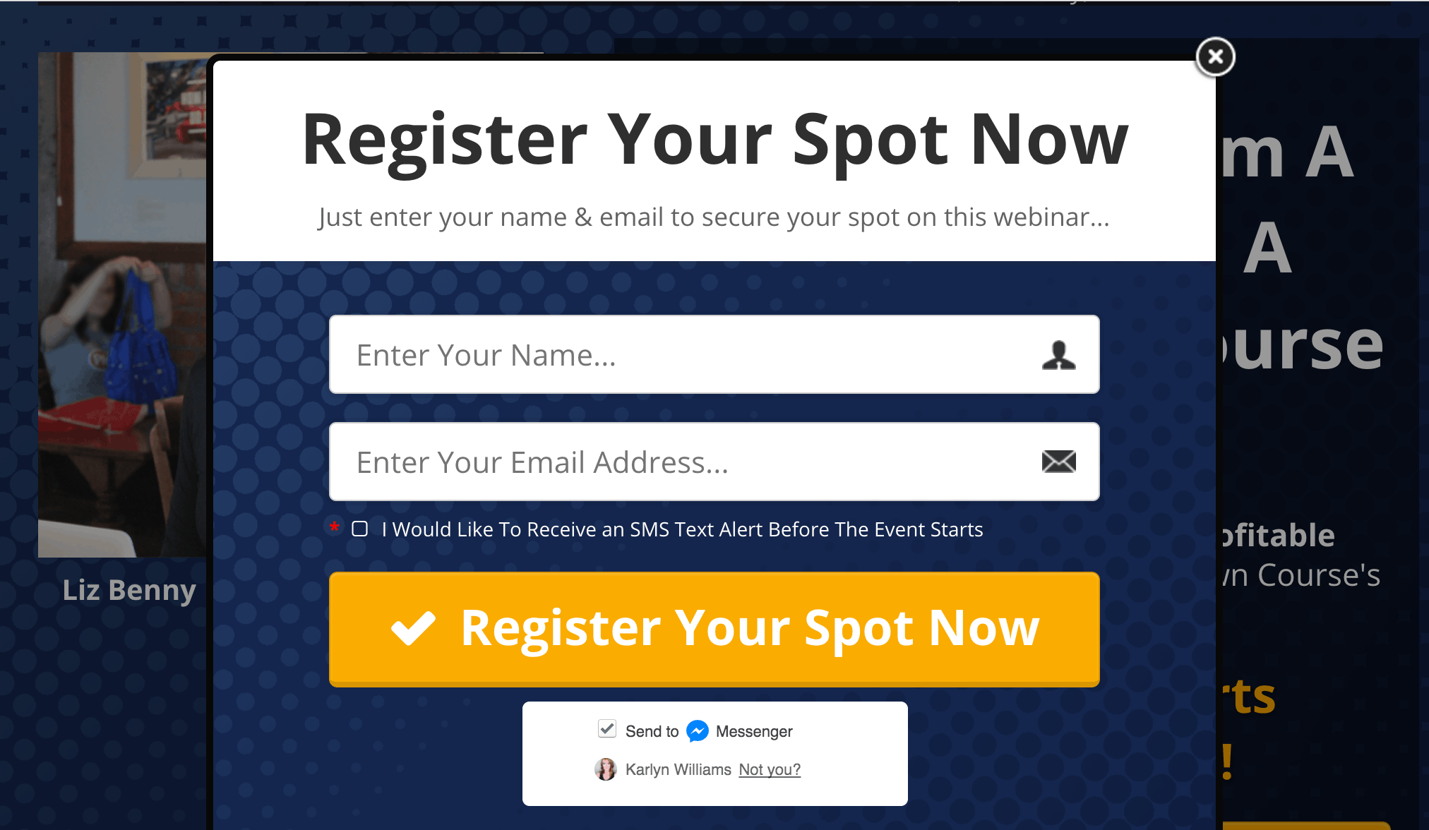
Check out this page that’s for the same webinar sign up mentioned in number two. When you navigate away, a pop up flies in and delivers exclusivity combined with a sense of urgency by using the copy, “register your spot now.”

As you start playing with different button copy, make sure you’re tracking your metrics and doing A/B tests to confirm what’s performing the best. You might be surprised by how one small tweak can make your conversions soar.

